The Edge of the Canvas: Why a Border Changes the Picture
See how a painted edge, frame, and wall steer attention, then compare one image in different surroundings with a simple, repeatable looking exercise.
The common mistake is to judge a painting as if its image ended exactly where your attention does. A canvas edge, frame, or strip of wall can redirect your gaze before you have consciously chosen where to look. Try this simple looking exercise with one image, and you can see how the border changes what feels central, distant, or complete.
Choose a painting you can view in person, or use a reproduction you can crop and display against different backgrounds. Keep the image itself unchanged. The point is to notice how its surroundings alter your reading, not to decide which presentation is universally correct.
1. Where does the painted image stop?
Start at the outermost mark. Does the paint reach the edge, stop short, or leave a clean band of bare ground? A painted edge is not merely a boundary between art and wall. It can also be an active line within the composition.
If a dark shape runs off the canvas, its cutoff may make the scene feel as though it continues beyond the picture. If a pale sky meets the edge without interruption, the image might feel open and unbounded. A narrow unpainted margin can instead make the painted area feel contained, like a view seen through a small opening.
Look at the four sides separately. A strong horizontal shape meeting the left edge may pull the eye outward, while a figure close to the bottom can seem grounded, crowded, or about to step out. The same mark can have a different effect at another edge because viewers approach a picture from its center and surroundings at once.
For a useful first pass, describe what touches each side without interpreting it: “blue field at top,” “dark form cut off on the right,” or “clear space along the bottom.” Then ask what each contact does to your sense of the scene. This keeps observation ahead of assumption.
2. What does the frame add?
A frame introduces another boundary between image and room. Its width, color, profile, and surface can make the painting appear more enclosed or more continuous with the wall. A substantial frame may direct attention inward by creating a clear visual stop. A slim profile can leave the painted edge more exposed.
Notice whether the frame echoes something in the image. A warm wood tone beside ocher paint might feel related, while a bright metal edge could form a crisp contrast. Neither choice automatically improves the picture. The useful question is whether the frame supports the image’s existing tensions or competes with them.
Also check where the frame catches the eye. A reflective surface or ornate corner can become a rival focal point, especially if the painting itself has quiet edges. Step a little to one side and see whether glare changes the balance. If you are choosing a frame, hold samples beside the image in the room where it will hang rather than judging them under shop lighting alone.
Not every edge needs a frame. A work on stretched canvas may have painted sides that are meant to remain visible, while a paper work may rely on a mat and glazing to protect and separate it. The medium and the maker’s presentation can guide the choice; where handling or conservation matters, ask a qualified framer or conservator.
3. How does the wall change the reading?
The wall is the largest border around many paintings, yet it is easy to ignore because it is not part of the artwork. A light wall can make a dark frame stand out. A wall close in value to the image may soften the separation and let the painting feel less like a separate object.
Look at the space immediately around the frame, not just the color. A narrow gap between neighboring works can make each edge feel crowded. More open wall can give the same painting visual breathing room, but an isolated placement may also make a small picture feel more self-contained. Room light, nearby objects, and the viewer’s approach all contribute.
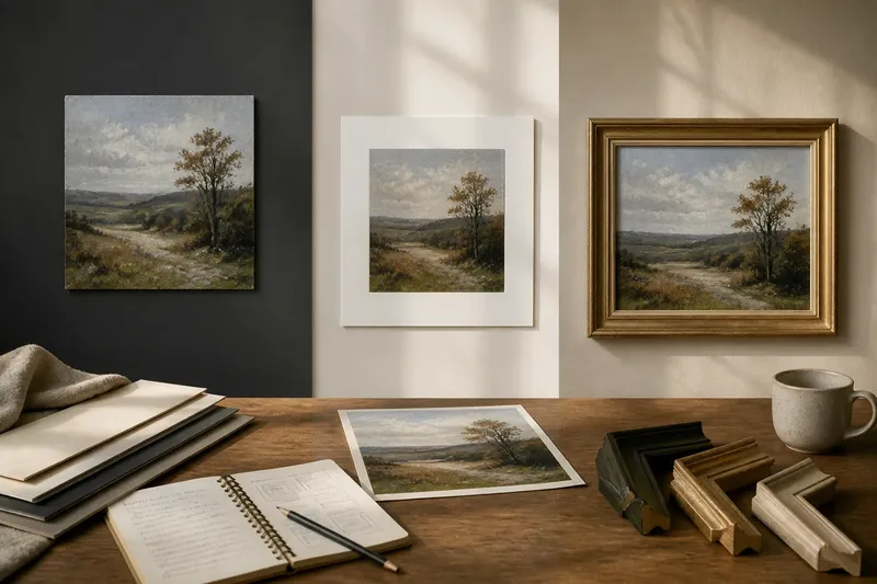
Imagine you have a small landscape reproduction on a pale sheet. First, place it against a dark charcoal background; then show the same sheet against a warm cream background, without changing the image or its size. Against charcoal, the paper edge may become prominent and the landscape may seem like a window cut into darkness. Against cream, the edge may recede, making the image feel more continuous with its setting. These are possible observations, not rules: check what your eye actually does.
4. How can you compare the same image?
Make a small display with a reproduction or digital copy. Keep the image’s scale and orientation constant. Change only the surroundings, so you can tell which shift comes from the border rather than from a different crop or viewing distance.
- Choose one image. Pick a painting with a noticeable feature near at least one edge, such as a branch, sleeve, horizon, or area of empty ground.
- Record the first reading. Note where your eye lands, what seems closest, and whether the scene feels open or enclosed.
- Show it without a frame. Place the image against a plain background and leave a modest band of space around it.
- Add a visual frame. Use a paper surround, a simple digital border, or an existing frame if it fits without covering the image.
- Change the wall color. Move the framed image from a light setting to a dark one, or use two neutral backgrounds with clearly different tones.
- Compare your notes. Mark any shift in attention, apparent depth, or sense of completion. Keep the changes you can point to, and set aside vague judgments such as “better.”
For a digital image, a simple slide or image editor can add a border and background without altering the painting. For a physical reproduction, colored paper or fabric works well; avoid attaching anything to an original artwork. The exercise is about visual relationships, not elaborate presentation.
5. What should you look for after each change?
Use the same questions each time. Which edge do you notice first? Does a shape seem to press against the frame or drift beyond it? Does the image feel like a scene, an object, or a view set inside another boundary? These prompts give you specific differences to compare.
Pay special attention to near-edge details. A small mark at the center may remain visually stable while a cropped object changes the whole sense of balance. A broad empty margin can make that object feel more isolated; a tight frame can make it feel compressed. The effect depends on the image, so avoid treating any one framing choice as a formula.
It can help to look briefly at the wall around the image before returning to the painting. That shift reveals how much of your attention was being held by the picture and how much by its presentation. You may also notice that the frame creates a second rectangle, one that either reinforces the canvas shape or sets up a contrast with it.
6. Which edge questions are worth asking?
Does a frame change the painting itself?
The painted marks remain the same, but their visual relationships to the room can change. A frame can make an edge feel more definite, separate, or prominent without altering the image.
Why do cropped objects attract attention?
A shape cut by the border suggests that it continues beyond the visible area. That implied continuation can pull your gaze toward the edge and make the scene feel larger than its frame.
Should the frame match a color in the painting?
It may, but matching is only one option. Compare whether the frame blends with the image, contrasts with it, or creates an unrelated focal point in the room.
Can wall color affect a small reproduction?
Yes, because the surrounding field helps define the image’s boundary. Try a light and dark background at the same viewing distance and notice whether the paper or frame becomes more visible.
7. What is not worth the effort?
There is little value in changing several things at once or searching for a single perfect border. If you swap the crop, frame, wall, and lighting together, you cannot tell which choice shifted your attention. A few controlled comparisons are more useful than an elaborate mock-up.
Keep the aim modest: identify what the boundary is doing for this particular image. The painted edge may invite the eye outward, the frame may hold it in, and the wall may quiet or sharpen both. When you look at another painting, start again with the marks that meet its edges; that is where its relationship to the surrounding room becomes visible.